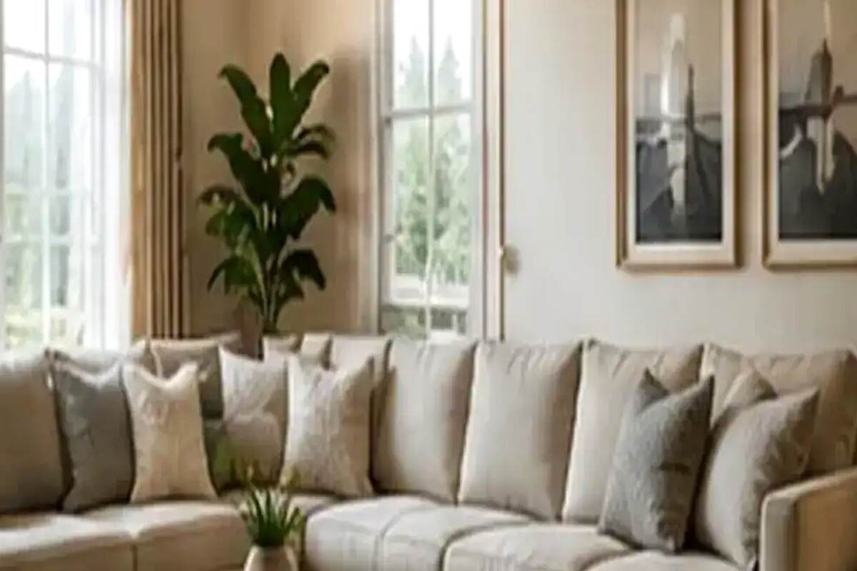
Dream home and garden planning becomes more rewarding when Choosing a Whole-Home Color Palette That Flows From Room to Room is treated as part of the whole space, which is why Dream Home Garden pairs home and garden perspective with thoughtful home garden ideas.
Most paint mistakes aren't about the individual color — they're about how that color relates to the room next to it. A home painted one room at a time, each color chosen in isolation, often ends up feeling disjointed even when every single color is, on its own, perfectly nice. A whole-home palette fixes that by treating the house as one connected composition instead of a series of separate decisions.
Start with the color you can't change
Every home has at least one fixed color element: flooring, a stone fireplace, kitchen cabinetry, a tile backsplash. Pull the undertone from that fixed piece — warm (yellow, orange, red-based) or cool (blue, green, gray-based) — and let it anchor every paint decision that follows. Fighting an existing floor's undertone with a mismatched wall color is one of the most common and hardest-to-fix whole-home color mistakes.
Practical checkpoint
Before moving on, make sure Start with the color you can't change is working for the space described in this guide. If that constraint is still unresolved, fix it before adding another layer of detail.

Build a three-tier palette, not a single color
A workable whole-home palette usually has three tiers: a dominant neutral used in most connecting spaces (hallways, living areas), one or two supporting neutrals a shade darker or lighter for definition (trim, ceilings, a study), and a small set of accent colors reserved for rooms with doors that close, like a bedroom or powder room, where a bolder choice won't clash with an adjacent open space.
Let sightlines decide where colors change
Walk through your home's main circulation path — the route you'd take from the front door through the most-used rooms — and notice where you can see two rooms at once. Any place two spaces are visible together needs colors that relate to each other, even if they're not identical. Color changes are safest at a doorway, a hallway turn, or another point where the sightline naturally breaks.
A whole-home palette isn't about using fewer colors. It's about making sure every color you use is in conversation with the one next to it.
Test large swatches in every room, not just the one you're painting
Paint a two-foot square in at least two spots per room, and view it at different times of day — north-facing rooms cast a cooler, grayer light than south-facing ones, which can shift how identical paint reads from room to room. A color that looks perfect in a sunny test room can look muddy in a north-facing hallway using the same can.
Use the 60-30-10 rule inside each room
Within any single room, a common and reliable ratio is 60 percent dominant color (usually walls), 30 percent secondary color (upholstery, curtains, a rug), and 10 percent accent color (pillows, art, small objects). Applying this ratio consistently across every room — even with different specific colors — is part of what makes a whole-home palette feel coordinated without looking matched.
Don't forget ceilings, trim, and doors
Standard 'ceiling white' and 'trim white' straight from a paint chart don't always match the undertone of your wall colors, and a warm wall color paired with a cool-toned white trim can look subtly off without an obvious cause. Test trim and ceiling colors alongside your wall colors, not as an afterthought chosen separately.
Practical tip
Keep a small binder or phone folder with every paint color, sheen, and brand used in your home, room by room. Touch-ups and future additions go far more smoothly when you're not trying to match a color from memory two years later.
Bring in one connective color, deliberately
Many professionally decorated homes repeat one specific color — a sage green, a deep navy, a warm terracotta — in small doses across multiple rooms: a pillow here, a vase there, a piece of art elsewhere. That repetition creates a subtle thread that ties a home together even when each room otherwise has its own distinct palette.
A whole-home color plan takes more upfront thought than picking one can of paint at a time, but it pays off every time you stand somewhere that two rooms are visible at once — which, in most homes, is almost everywhere.
Sequencing: which rooms to paint first
If you're rolling out a whole-home palette gradually rather than all at once, start with the connecting spaces — entry, hallway, and any open-plan living area — since those set the tone every other room reads against. Painting a single bedroom first, in isolation, gives you the least information about whether your broader palette actually works together, since it's the room least visible to the rest of the plan.
Once the connecting spaces are settled, move to the rooms adjacent to them, working outward the way ripples move from a point dropped in water. Bedrooms and other closed-door spaces can reasonably come last, since they're the most forgiving of the group — a color that doesn't quite relate to the hallway matters far less behind a closed door than one that clashes in an open sightline.

Make the room work before styling it
Choosing a Whole-Home Color Palette That Flows From Room to Room should support the way the room is actually used. Start with Start with the color you can't change and test it against Build a three-tier palette, not a single color: circulation, seating, storage, light, and sightlines should still work when the room is busy. Keep doors and drawers able to open fully and avoid placing bulky pieces where they create a pinch point. The goal is a room that feels considered without requiring people to move the furniture every time they use it.
Practical checklist before you finish
Before you finish work on Choosing a Whole-Home Color Palette That Flows From Room to Room, use a short final pass to check the main constraint, everyday access, dimensions or conditions, visual balance, and the amount of maintenance the finished result will require.
- Confirm the main goal is still clear.
- Check dimensions, access, and everyday circulation.
- Leave enough space for normal use and future growth.
- Remove details that add work without improving the result.
Frequently asked questions
How many total colors should a whole-home palette include?
Most successful whole-home palettes use somewhere between five and eight colors total, including neutrals, trim, and accents. Fewer than that can feel monotonous across a larger home; significantly more makes it hard to maintain a sense of flow between spaces.
Should every room be a different color?
Not necessarily — many well-designed homes repeat the same wall color across several connected rooms and reserve color changes for spaces with a door that closes. Repetition in open-plan areas is often what makes a home feel calm rather than busy.
What's the easiest way to fix a home that already feels disjointed?
Start with the most-used sightline in the house — often the view from the kitchen into the living room — and bring those two spaces into better alignment first. Fixing the one path you walk through daily delivers most of the improvement before you touch a single guest bedroom.
Can bold, saturated colors still fit into a whole-home palette?
Yes, as long as they're placed deliberately — usually in a room with a door that closes, or as a repeated accent rather than a wall-to-wall treatment in an open area. A single bold room reads as a confident design choice within a coordinated home; several unrelated bold rooms scattered throughout tend to read as chaotic instead.
Keep reading
Continue with these related Dream Home & Garden guides: